Now that we have a brokerage and a program ready to analyze graphs we are ready to get into the technicalities of trading.
The RSI is basically a visual buy/sell ratio of a stock. The RSI is displayed as an oscillator and can have a reading from 0 to 100. The top line represents a value of 70 and when the graph reaches 70 or above, the stock is becoming overbought or overvalued and may be primed for a trend reversal or corrective pullback in price. Contrastly, an RSI reading of 30 or below indicates an oversold stock and may be primed for a trend reversal or an increase in the stocks price.
The RSI is a good indicator for predicting when the price of a stock is going to rise or fall. We will be using the RSI to find stocks that are currently being overbought and are above the value of 70 and are red. An example is shown below:

The photo above shows the 180D 4H chart for $JBLU and as you can see the RSI (bottom half of the photo) shows that it is being overbought which is indicated by the line being above the top yellow line and is colored red. This is an indication that the price of the stock may drop and it did drop significantly after it was being overbought and shifted into oversold territory.
But just because a stock is being overbought, doesn't mean the price of the stock is guaranteed to drop. Which is where the Moving Average Convergence Divergence (MACD) indicator comes in.
The MACD is the indicator we use to confirm whether or not to buy a put option. The MACD is an indicator that helps investors understand whether bullish or bearish movement in the price is strengthening or weakening. It is a more complicated indicator but basically when the blue line is above the yellow line, then the stock is bullish and the price of the stock is projected to increase. If the blue line is below the yellow line then the stock is bearish and the price of the stock is projected to fall.

As you can see from the photo above, the stock was being overbought, which alerted us that this could be a potential put option and then we waited for the MACD to converge and for the blue line to converge the yellow line. Once the blue line was below the yellow line and the stock was bearish, we bought the put option and made a profit depending on how far it went down. We will cover on the next page when to exit out of an option and to secure any gains we have made.
The VWAP is a more optional indicator that I personally use to determine when to buy and sell an option contract.

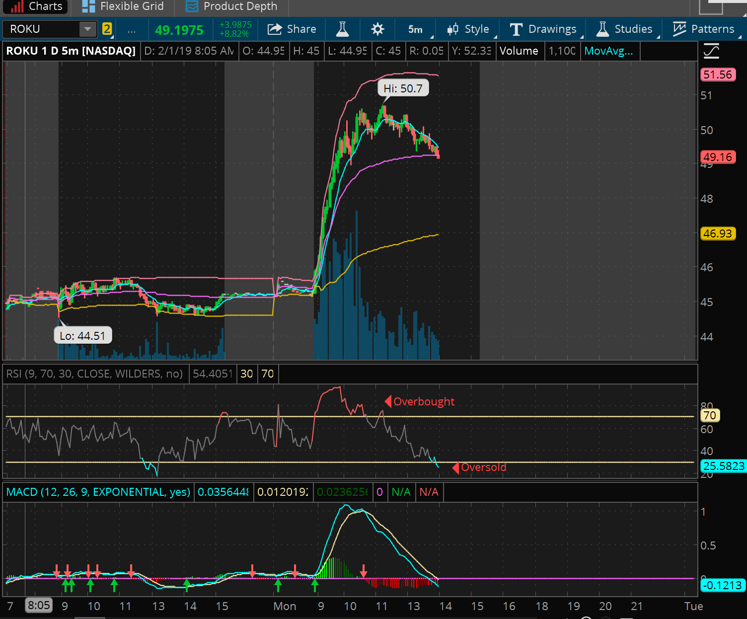
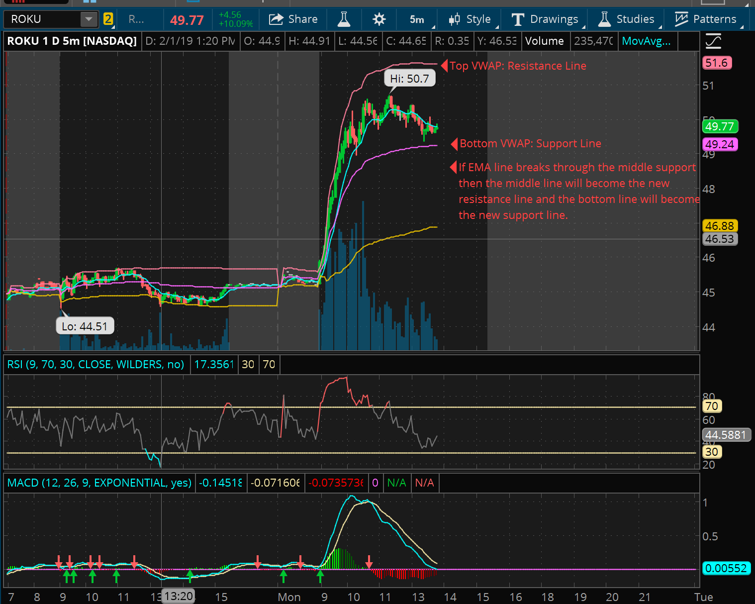
Typically the VWAP indicator shows buyers when to buy and sell options. It is an extra indicator that is optional and is not required in order to succeed in options trading. All you need to understand about the VWAP is that the two VWAP lines the current stock is trading at act as the support and resistance line. The VWAP line above the current price acts as the resistance line while the VWAP line below the current price acts as the support line. This indicator predicts when a stock might bounce or drop back down. When the price appraoches the top resistance line, there is a good chance it will bounce back down and not go past the resistance line. The VWAP is not always guaranteed and the price could easily go past the resistance line or go below the support line. If the price breaks the middle support line, then it is not between the middle line (new resistance) and the bottom line (new support). I find it useful as it shows the support and resistance lines as I typically try to buy a put when it is approaching the resistance line and the other indicators show that it is going to drop after hitting the resistance line.